How to Design a Logistics Company Logo from Scratch
If you want to know how to design a logistics company logo from scratch, you can start by thinking about your brand like you plan a delivery route. You don’t need fancy software or a design degree. Many companies see big changes after updating their logos:
57% of people feel more likely to buy from a brand with a new logo
21% jump in positive brand perception
You just need the right tools and a clear plan.
Key Takeaways
Define your brand values clearly. Use colors and symbols that reflect trust, efficiency, and reliability in your logo.
Know your audience. Design your logo with their preferences in mind to create a strong connection.
Keep your logo simple. A straightforward design is more memorable and works well across various platforms.
Choose the right colors. Colors like blue, green, and black convey important messages about your brand.
Test your logo with real people. Gather feedback to ensure it resonates with your target audience and represents your brand effectively.
How to Design a Logistics Company Logo
Designing a logo for your logistics company feels a lot like planning a delivery route. You want to get from point A to point B in the most effective way. Each step matters. You need to know where you are going and what you want to show the world. When you learn how to design a logistics company logo, you set the direction for your brand’s journey.
Tip: Think of your logo as your company’s map. It guides customers to your business and helps them remember you.
Let’s break down the first steps.
Define Brand Values
Start by asking yourself what your company stands for. Do you want people to see your business as trustworthy, fast, or reliable? Maybe you want to show that you care about the environment or that you always deliver on time. Successful logistics company logos often highlight values like trust, efficiency, reliability, and professionalism. These values shape how people see your brand.
Here are some common brand values and how you can show them in your logo:
Brand Value | How to Show It in Your Logo |
|---|---|
Trust | Use blue or green colors, clean shapes |
Efficiency | Add arrows, clocks, or movement symbols |
Reliability | Choose strong fonts, simple icons |
Professionalism | Keep the design neat and easy to read |
You can also use color to send a message. For example:
Blue feels calm and logical.
Green means balance and eco-friendliness.
Brown stands for stability and dependability.
When you focus on your core values, you make your logo stand out from the crowd. This is a key step in how to design a logistics company logo that truly fits your business.
Know Your Audience
Next, think about who will see your logo. Are you working with big companies, small businesses, or everyday people? Your audience shapes your design choices. If your clients want fast deliveries, you might use symbols like arrows, trucks, or even a stopwatch. These images show speed and movement.
Take a look at logos from top logistics brands. You will notice they use:
Color psychology to build trust and show what they stand for.
Symbols that represent speed, reliability, and movement.
Simple, bold fonts that are easy to read.
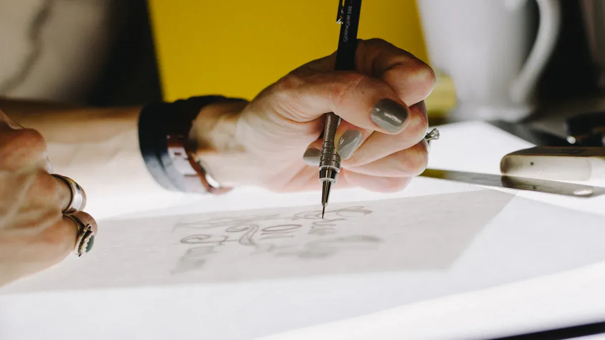
Note: Many experts suggest you start your design in black and white. This helps you focus on the shape and style before adding color.
Here’s a quick checklist to help you get started:
Reflect on your company’s core values.
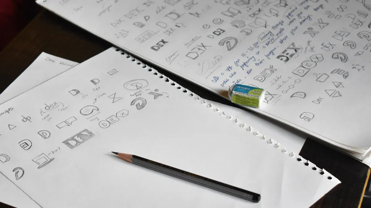
Analyze logos from other logistics companies for ideas.
Sketch your first designs in black and white.
Keep your logo simple. A clear, high-quality logo works well on websites, trucks, uniforms, and business cards. When you know your audience and what they care about, you can create a logo that speaks to them.
Learning how to design a logistics company logo is all about planning, just like mapping out a delivery route. Take your time with these first steps, and you’ll set your brand up for success.
Colors & Styles

Best Colors for Logistics
Choosing the right colors for your logistics logo can make a big difference. Colors send messages before you even say a word. You want your logo to show trust, speed, and reliability. Here are some top choices:
Blue: Most logistics companies use blue in their logos. Blue stands for trust, maturity, reliability, intelligence, and calmness. People see blue as dependable and professional. That is why blue is the most common color in business logos.
Green: Green means health and eco-friendliness. If your company cares about the environment, green helps build trust with customers who value sustainability.
Red: Red grabs attention and shows urgency. It works well if you want people to think of fast service or quick action.
Black: Black gives your brand a sense of authority and sophistication. It helps your company look strong and serious.
Gray: Gray stands for neutrality and professionalism. It makes your brand look trustworthy and balanced.
Tip: Try mixing two of these colors for a modern look. For example, blue and gray together can show both trust and professionalism.
Logo Styles That Work
The style of your logo matters just as much as the color. You want something that looks good on trucks, websites, and business cards. Here are some popular styles for logistics logos:
Logo Type | Description |
|---|---|
Text-based Logos | Use simple letters or words. They look professional and easy to read. |
Icon-based Logos | Use symbols like arrows, trucks, or boxes. These logos feel lively and fun. |
Combination Logos | Mix text and icons. This style balances creativity with professionalism. |
Geometric Shapes | Use sharp corners for strength or curves for a softer feel. |
Simple designs with smart color choices work best.
Inspirational logos connect with your audience and make your brand memorable.
If you want to know how to design a logistics company logo that stands out, start with the right colors and a style that matches your brand values.
Design Essentials
Simplicity Matters
When you start thinking about how to design a logistics company logo, keep things simple. Simple logos work best for logistics brands. They stick in people’s minds and look good everywhere—on trucks, websites, and business cards. You want your logo to make a strong impression the first time someone sees it.
Here’s why simplicity matters:
A great logo leaves an impression. If your audience sees your logo once and remembers it later, it’s doing its job.
Logos that are too generic or overly complex tend to be forgettable. Unique and focused designs tend to stick.
Your logo may not be helping your brand if people can’t recall or recognize it.
Logos for transportation companies should be straightforward, distinctive, and easy to remember.
Minimalist logos provide psychological advantages to customers along with their clear visual appeal.
The simplicity of a brand logo promotes better memorability, so your brand can remain foremost in customers' minds.
People tend to recall simple designs better, so you get higher memorability rates.
Tip: Avoid using outdated visuals or too many details. These can make your logo hard to see on small items and may confuse your message.
Typography & Icons
Typography and icons play a big role in your logo’s style. You want fonts that are bold and easy to read. Simple, strong letters show reliability and professionalism. Stay away from fancy or thin fonts. They can look messy or weak.
Icons help tell your story fast. The right symbol can show what your company does without using words. Logistics logos often use:
Customer or supplier icons to show the start and end points of a delivery.
Process flow icons to highlight movement and efficiency.
Workcell icons to represent teamwork and organized resources.
Note: Don’t use irrelevant images or generic symbols. Your icon should match your brand and stand out from the crowd.
If you keep your logo simple and choose the right font and icon, you’ll create a design that’s easy to remember and looks great everywhere.
Tools & Resources
Free Logo Makers
You don’t need to be a designer to create a great logistics logo. Many free online tools make the process simple and fast. Tools like Vistaprint, Canva, and Turbologo let you start with just your business name. You can try out different colors, icons, and fonts until you find the right look.
Let’s compare two popular choices for logistics startups:
Feature | Shopify Logo Maker | |
|---|---|---|
Customization Options | Unlimited high-quality downloads, easy to use | Total editing access, unlimited revisions |
Design Process | Generate hundreds of designs based on business name | Choose from stylish templates, easy to use |
User Experience | No design skills necessary, intuitive interface | No experience needed, user-friendly |
File Formats Available | PNG, SVG vector files, and more | Optimized for digital and print use |
Online logo makers save you time and money. You can get a logo in minutes. Here’s what you should know:
Online Logo Makers: These tools are quick, easy, and budget-friendly. You can try many designs without spending much. But sometimes, the logos look less original or professional.
Professional Design Services: Designers cost more, but they give you a unique logo and a strong brand image. You get a logo that stands out and makes a great first impression.
Tip: If you want a fast and affordable logo, start with an online maker. For a one-of-a-kind look, consider hiring a designer later.
Templates & Tutorials
Templates make designing even easier. You can pick a template, change the colors, and add your company name. Canva offers many templates for logistics companies. You can also find step-by-step tutorials on YouTube that show you how to use these tools.
Here are some top templates for logistics logos:
Logo Template Name | Link |
|---|---|
Black Flat Illustrative Logistics Services Logo | |
Blue Minimalist Trucking Logo | |
Black Red Flat Illustrated Cargo Delivery Logistic Transport Logo | |
Orange Black Simple Delivery Logo |
You can watch YouTube tutorials for step-by-step help. These videos show you how to use templates, pick colors, and add icons. With the right tools and a little practice, you can design a logo that fits your logistics brand perfectly.
Final Steps
Test & Get Feedback
You’ve designed your logo. Now it’s time to see how it works in the real world. Testing your logo helps you make sure it matches your brand and connects with your audience. You want your logo to look great everywhere—on trucks, websites, and business cards.
Here’s how you can test your logo:
Plan your test. Think about your brand and who you want to reach.
Survey your target audience. Ask people who fit your market for their opinions.
Use rank tests. Let participants rank their favorite logo designs.
Try multiple choice questions. Find out which design stands out.
Use MaxDiff tests. Discover which elements people love or dislike most.
Regular feedback makes your logo stronger. Ask company owners, team members, and even customers for their thoughts. Compare two or three designs side by side. Check each logo against your creative brief to make sure it shows your company’s message and services.
Testing helps you see if your logo sends the right message. You can spot problems early and fix them before you launch. A good test also checks if your logo works in different sizes and places.
File Formats
Once you finish your logo, you need to save it in the right file formats. This step is important for quality and flexibility. You want your logo to look sharp on every platform.
Here are the most common file formats for logistics company logos:
Raster files (like PNG and JPG) work well for web use, but they can lose quality when resized.
Vector files (like SVG, AI, or EPS) are best for branding. They keep your logo crisp and clear at any size.
Let’s look at why vector files are so useful:
Vector graphics stay sharp no matter the resolution.
They use less storage space than raster images.
You can resize them for any application without losing quality.
Editing is easy, so you can update your logo quickly.
You can use them on websites, print, and more.
Printing always looks sharp and accurate.
Vectors work well with new technology, so your logo stays future-proof.
Tip: Organize all your logo files and check their quality before you launch. Send the files to your team or designer with clear instructions. This way, everyone knows how to use your new logo for digital and print materials.
You’ve learned how to design a logistics company logo from scratch. Start with your brand values, pick colors and styles that fit, and use online tools to create your design. Keep testing your logo and gather feedback often. This helps you stay consistent and adapt to what your customers want.
Ongoing feedback lets you spot trends and fix issues fast.
Regular input helps you meet customer needs and keep your brand strong.
Once you finish, download high-resolution files and use your new logo on trucks, websites, and business cards. Your logo will guide your brand’s journey.
FAQ
What makes a logistics logo stand out?
You want your logo to be simple, bold, and easy to remember. Use strong colors and clear shapes. Add a unique icon or font that matches your brand. People notice logos that look different from the rest.
Can I design a logo without hiring a professional?
Yes, you can! Free online tools like Canva and Turbologo help you create logos fast. You just pick a template, add your business name, and choose colors. You don’t need design skills to get started.
Which file format should I use for my logo?
You should save your logo as a vector file, like SVG or AI. These files stay sharp at any size. PNG works well for websites. Always keep both formats handy for different uses.
How do I know if my logo works for my audience?
Ask people for feedback. Show your logo to friends, team members, or customers. Use surveys or simple questions. If most people remember it and like it, you’re on the right track.
What colors work best for logistics logos?
Blue, green, and black work great for logistics. Blue shows trust. Green means eco-friendly. Black looks strong and professional. Try mixing two colors for a modern look.
Tip: Test your color choices on different backgrounds!
See Also
Key Logistics Trends Influencing Tomorrow's Industry Landscape
PGL's Miami Warehouse Solutions Ensure Quick East Coast Shipping
Crucial Strategies for Effective Global Logistics Operations
Premier Global Logistics Enhances East Coast Import Services
Understanding Premier Global Logistics' East Coast B2B Services